
If you built your own website on Wix, you might be wondering, does my website need a redesign? Many business owners start with a DIY approach, but as their business grows, they notice problems with their site that could be driving potential clients away.
Here are some clear signs that your Wix website might need a redesign:
- It looks cluttered – Too much text or an unstructured layout can overwhelm visitors.
- Navigation is confusing – If users struggle to find key information, they may leave before contacting you.
- Your site doesn’t look professional – Default Wix fonts, outdated colors, or inconsistent branding can make your website seem untrustworthy.
- Key features don’t work – Clickable phone numbers, contact forms, or buttons should work seamlessly.
- You’re missing legal essentials – A cookie consent banner and privacy policy page help protect your business from potential penalties.
If any of these sound familiar, you’re not alone. That’s exactly what happened with Samuel Moshe Nachfolger, a tax accountant serving US expats in Israel. His Wix website had some great content, but it needed professional refinement to work effectively.
Here’s How I Improved a Wix Tax Accountant Website
Samuel originally built his own Wix website, and while it had useful information, it was cluttered, hard to navigate, and missing key features.


Here’s how I transformed it:
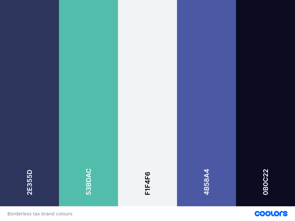
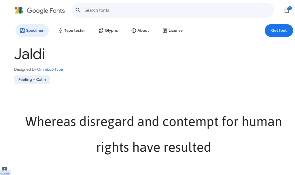
- Refined the design – I updated the color scheme to match Samuel’s branding and replaced the Wix default fonts with professional typography (Kaisei Tokumin for headings, Jaldi for paragraphs).
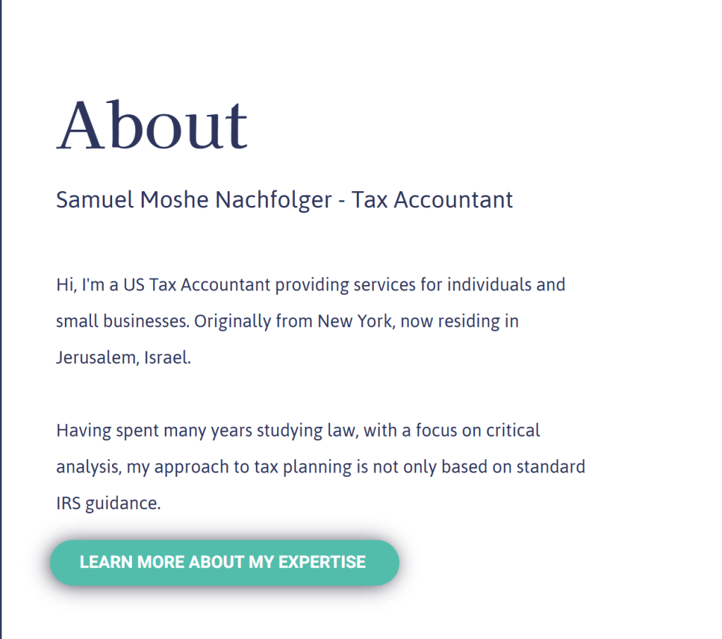
- Improved navigation – Instead of overwhelming visitors with too much text, I structured the homepage to preview key sections (Services, About, and Contact) with clear buttons to learn more.
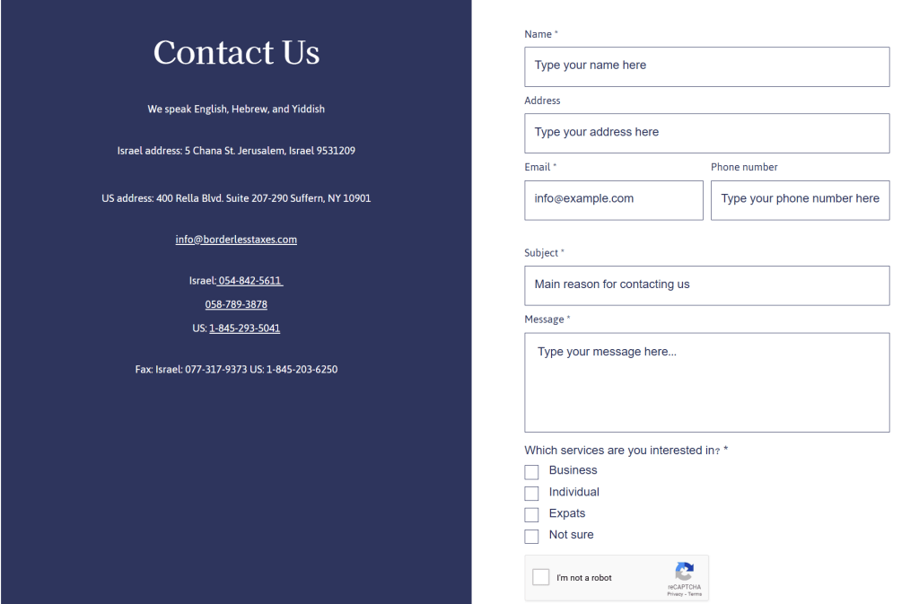
- Fixed broken features – The phone number in the contact section is now clickable, making it easier for potential clients to call Samuel directly.
- Optimized the contact form – Required fields are clearly marked, and users now get a success message telling them when to expect a response.
- Added legal essentials – The site now includes a cookie consent form and a privacy policy page, ensuring compliance with regulations.

After these improvements, Samuel’s website is now easy to navigate, looks professional, and helps clients get the information they need quickly.

Visit Samuel’s website here .
Watch the video showing the redesign of Samuel’s website
Does My Website Need a Redesign? Get Professional Wix Help
If you’re wondering, does my website need a redesign?, the answer might be yes if you’re facing similar issues.
A well-designed Wix website can help you stand out, build trust, and turn visitors into clients. If you need help improving your Wix website, let’s talk!
Click here to get in touch.
FAQs
If your website looks cluttered, has confusing navigation, outdated design, or broken features like non-clickable phone numbers and contact forms, it may need a redesign. A professional update can improve user experience, branding, and functionality to help convert visitors into clients.
A redesigned Wix website enhances user experience, improves navigation, strengthens branding, and ensures key features work correctly. It can also include essential legal elements like a cookie consent banner and privacy policy to keep your business compliant.
Yes! A professional can refine your design, fix broken features, optimize navigation, and ensure your site looks professional. Whether it’s updating fonts, improving layout, or adding essential compliance pages, expert help can make your Wix site more effective at attracting clients.
Leave a Reply